
A window can feel like a small stage, with light slipping across the glass and frame like a quiet performance. To paint it well in digital art, you start with a solid reference, then build each part in clear layers so the frame, glass, and reflections never fight each other. From there, you shape depth, soften key edges, and tune the tint until the surface feels alive, and that’s where the real trick begins.
Choose a Window Reference
A good window reference can make digital painting feel much easier, especially provided you want your scene to look real and balanced. You’re not guessing alone, and that helps.
Start your window selection through looking for clear shapes, clean light, and a view that matches your mood. Good reference photos show how glass catches light, how frames sit, and how shadows fall.
Pick images with simple angles initially, then try harder views once you feel steady. You can save a few options so you’re never stuck with only one choice. That little backup plan can calm your nerves and keep your work moving.
Whenever you choose carefully, you give yourself a friendly guide, and your painting feels more like home.
Sketch the Window Frame
Now that you’ve picked your reference, sketching the window frame gives your painting its steady base. You’re mapping the shape that everything else will trust, so keep your lines light and calm. Focus on proportion accuracy, and check each side against the reference before you press harder.
This step feels easier when you break it into small parts, and you’re not alone if it takes a few tries.
- Start with a simple rectangle or arch.
- Mark the center lines initially.
- Compare top, bottom, and side widths.
- Adjust corners before adding detail.
- Consider about material selection so the frame fits the style.
Block In the Glass Color
Lay in the glass color with a light, even touch so your window starts to feel real without getting heavy too soon. You’re not chasing detail yet; you’re building trust with the shape. Use color blocking to set one calm base for the pane, then soften any hard edges so the frame still leads the eye. Should your window have old charm, add stained overlays in thin passes, like gentle tints that suggest colored glass without crowding the scene.
| Step | Focus |
|---|---|
| 1 | Pick one base tone |
| 2 | Fill the pane lightly |
| 3 | Keep strokes smooth |
| 4 | Add thin overlay color |
| 5 | Check the balance |
Stay steady, and let each pane sit with the others like neighbors who know each other well.
Add Light and Reflections
Start beside placing your light source initially, because it tells you where every shine and shadow should go.
Then lower the reflection strength so the glass still looks see-through, not like a mirror.
Finish with small highlight details along the edges and curves, since those tiny marks make the window feel bright and real.
Light Source Placement
Place your light source before you add any shine, because that one choice sets the whole mood of your digital window.
You want directional lighting to tell viewers where the sun sits, then let soft backlighting effects warm the frame from behind.
Once you keep that spot steady, your highlights feel natural, and your glass looks like it belongs in the scene.
Try these simple checks:
- Put the light high for noon.
- Place it low for sunset.
- Keep one side brighter than the other.
- Match nearby walls and sky color.
- Let the glow follow the window edges.
This helps you and your piece stay connected, since the window stops looking flat and starts feeling real.
Reflection Intensity Control
Now that your light source is set, you can control how much of that light bounces off the glass and frame. Start by lowering opacity on the reflected area, then build a soft reflective gradient so the shine feels real, not loud.
Provided the window faces a bright sky, raise the value a little more; in case it sits in shade, keep it gentle. Use specular control to decide where the strongest sparkle belongs, and let the rest fade smoothly.
You’re not chasing perfection here, just a believable balance that fits your scene. With each small change, the window starts to feel anchored in the room. And once the reflection breathes with the light, your artwork feels like it belongs there too, calm and complete.
Glass Highlight Details
Often, the smallest highlights make glass feel alive, so you want to treat them with care.
After you set the main reflection, add tiny light marks where the window catches the sky or room light.
You can use a thin brush or pencil tool for clean specular streaks, then soften only the edges that need it.
Keep the brightest points near curves, corners, and overlap lines, because that’s where glass usually shines.
- Place a rim sparkle on one edge
- Break long reflections into shorter shapes
- Match highlight color to the light source
- Keep one side dimmer for depth
- Zoom in so you can stay precise
Show Interior or Exterior Depth
To show interior or exterior depth in Paint, you need to weigh like you’re building space, not just drawing objects. Start by placing the window frame so it feels steady, then use perspective distortion to angle the inner edges slightly. That tiny shift helps your scene feel lived in, like someone could step through it. Next, add ambient occlusion in the corners and along overlaps, because soft shadowing tells the eye where surfaces meet.
| Depth cue | Effect |
|---|---|
| Dark corners | Push space inward |
| Offset lines | Suggest angle |
| Layered shapes | Add separation |
Should you want an outside view, keep distant shapes lighter and simpler. In case you want an inside view, let the room edges recede cleanly. You’re not just painting a window. You’re inviting someone into the scene.
Refine Glass Texture and Clarity
You can make the glass feel real via softening the surface just enough to catch gentle reflections from the scene around it.
Keep the edges crisp where the frame meets the pane, then let the center stay a bit lighter so the glass still looks clear.
With small shifts in transparency, you’ll add depth without making the window look foggy or flat.
Surface Reflections
Tracing surface reflections in Paint starts with a careful eye, because glass looks best whenever it feels clean, sharp, and a little alive.
You can build that feeling through placing thin specular streaks where light would slide across the pane, then softening nearby tones so the shine stands out.
Whenever the window faces a bright sky, add a faint anisotropic sheen to guide the eye across the surface.
- Keep highlights narrow and calm.
- Match reflection direction to the scene.
- Use lighter strokes for distant glare.
- Blend edges just enough to feel natural.
- Step back and check the whole window.
As you adjust, stay gentle and patient.
That way, your glass joins the image with ease, and the reflections feel like part of your space, not a separate layer.
Edge Sharpness
Sharp edges can make glass look crisp, clean, and believable in Paint, so start through tightening the window frame and the outer lines of the pane. You’ll join the scene sooner whenever you keep those borders steady and confident. Use a small brush, then compare each side so the shape stays even.
| Tool | Best use | Result |
|---|---|---|
| Pencil | Trace corners | Clean outline |
| Brush | Smooth joins | Neat frame |
| Eraser | Trim stray marks | Sharper edge |
After that, blend only the inner edge with soft shifts so the glass doesn’t feel cut out. Add feathered edges where the pane meets shadow, and you’ll keep the window clear without losing structure. Tiny corrections matter here, and they help your work feel polished and welcoming.
Light Transparency
Now that the frame looks clean, it’s time to make the glass feel real through allowing light pass through it. You can do this by softening the center and keeping the edges a bit darker, so your window feels open and alive. Use translucent overlays to tint the pane without hiding the scene behind it. Then add subtle glazing with a light brush pass to suggest shine, dust, and air.
- Keep your stroke pressure light
- Blend only part of the pane
- Leave a few bright spots clear
- Match the tint to nearby light
- Recheck clarity after each pass
If the glass feels too solid, lower opacity and try again. Small changes help you build a window that feels shared, warm, and believable.
Detail Frames, Sills, and Trim
To make your digital window look real, give the frame, sill, and trim the same care you’d give the glass itself. You can deepen the frame with soft shadows, then lighten the sill so it feels like it catches room light.
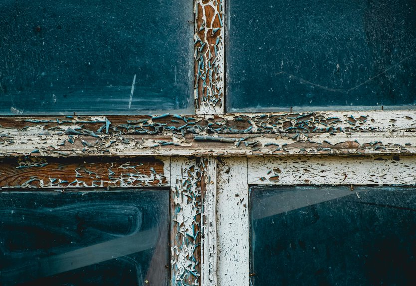
Next, add trim patterns that match the style you want, from plain lines to carved edges. Should you want a lived-in touch, place small scuffs near corners and use hardware detailing around latches, hinges, and pulls.
These little marks help your window feel like part of a real space, not a cutout. Keep your edges clean, but don’t make them perfect. That balance helps your work feel friendly and familiar, like it belongs in a home you know.
Avoid Common Window Painting Mistakes
Even simple window art can go off track fast, but you can avoid the most common slipups with a little care. You’ll feel better whenever your digital pane looks clean, balanced, and ready to share. Start alongside using light strokes, because heavy pressure often causes brush smudging. Keep your colors close in value, too, since harsh jumps can create color banding. Then check edges often, so frames stay crisp and glass details don’t blur together.
- Zoom in before you paint.
- Use undo whenever a stroke lands wrong.
- Paint on separate layers whenever you can.
- Pick a softer brush for blends.
- Save often, so you can relax and keep going.
If you rush, tiny mistakes spread fast. So slow down, trust your tools, and keep your window design steady.
Frequently Asked Questions
How Do I Open Paint on Windows?
Click the Start button, type Paint, and press Enter. You can also press the Windows key, then S, type Paint, and open it. If you are using a touch device, tap Search and launch it with touch support.
What Tools Does Paint Include for Digital Painting?
You’ll get pencils, brushes, fill tools, shapes, eraser, text, selection, zoom, layers, Image Creator, and background removal. Brush options let you paint with precision, while the color picker helps you sample and match tones accurately.
Does Paint Support Layers and Background Removal?
Yes, Windows 11 Paint includes layers and background removal, giving you more control while you create and edit. This makes the editing process smoother, especially when you are testing that theory.
Can I Use Paint Online Without Installing It?
Yes, you can use Paint online without installing it. Open a browser based editor like canvaspaint.org in your browser, though browser limits may affect some tools. The interface will still feel familiar.
What File Formats Can Paint Save and Share?
Paint can save and share files as PNG, JPEG, BMP, GIF, TIFF, and WebP. Color profiles stay intact for consistent display, and sharing works smoothly across devices.